Businesses around the world rely on HubSpot, a company that sells top-of-the-line lead generation software, for their products as well as general sales and marketing expertise. They share this expertise through both their blog and their users.
In light of this, they’ve established a network of user groups around the world for people to get together and discuss how they’re using the software in their own organization, share ideas, discuss industry trends, and much more. These meetups serve as an opportunity to network with other “HubSpotters” in your area and learn new ways to incorporate the software into your inbound marketing strategy.
On Wednesday, June 15th, I had the pleasure of attending a HubSpot User Group (HUG) meetup in Buffalo, NY at Sweet_ness 7 Cafe. The purpose of the meetup was to collaborate with marketing specialists from other agencies and local businesses, share our experiences, and take something new back to our own companies to incorporate into our day-to-day operations.
The majority of the meeting was spent discussing user experience (UX) and search engine optimization (SEO) on local businesses’ websites, which we’ll get into below. Before we dive into the specific examples we analyzed, it’s important to note that we focused on immediate observations (or what a real user would think when visiting the site), basic UX, and some elements of SEO.
Local Business Website Analysis
At the HUG meeting, the group analyzed three different websites based on a simple, yet comprehensive, site analysis guide.
Let’s take a look at and evaluate these sites based on the elements mentioned above.
#1: SWRemote
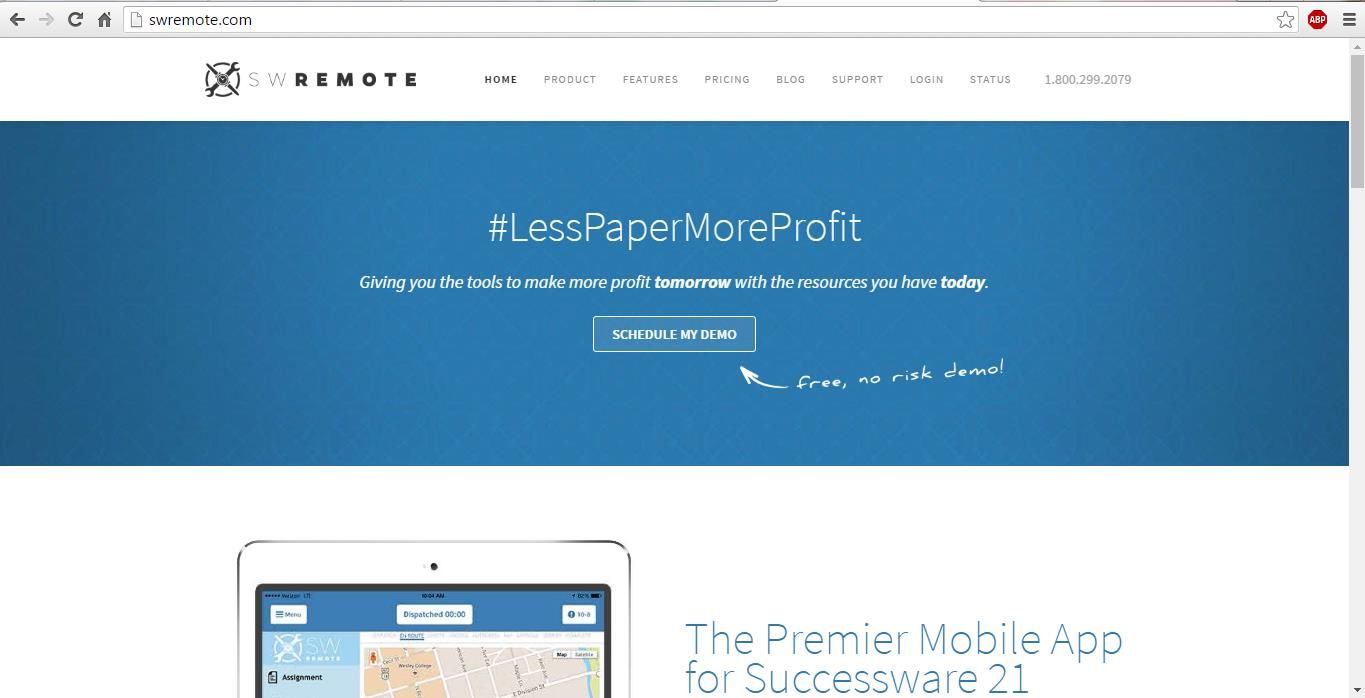
The first thing we did was look at the site for only five seconds and evaluate the first page. Take a quick look at the screenshot below and see if you can identify what SWRemote does:
My first interpretation was that the company performed some sort of data analysis ‒ perhaps human resources software? It was only after I noticed the text next to the iPad that I learned the site was a tool for software management. And this was after the initial five seconds we were given. This is important because many users don’t make it past the first five seconds on a website. If people can’t figure out what your company does within that short time frame, you may lose them.
I mentioned the text next to the iPad, but notice that this text and the associated image are located below the fold, which means that users have to scroll down to see it. Being mindful of where your best info is located is key since you shouldn’t assume that your users will do anything.
From a first impression/visual perspective, this site was a little plain and nondescript. However, I did like the eye-catching elements of the hashtag, #LessPaperMoreProduct, as well as the CTA allowing you to schedule a demo.
It’s good to point users to a specific action you would like them to take, but it’s also important to make sure you’re asking them to do certain things at the right time. With this CTA, we’re asked to schedule a demo before we really understand what this company does. The UX of this site could be improved by offering a little more information before trying to schedule anything concrete. A CTA such as “Learn More” would be helpful in this case.
#2: Rochester Institute of Technology Online Executive MBA Program
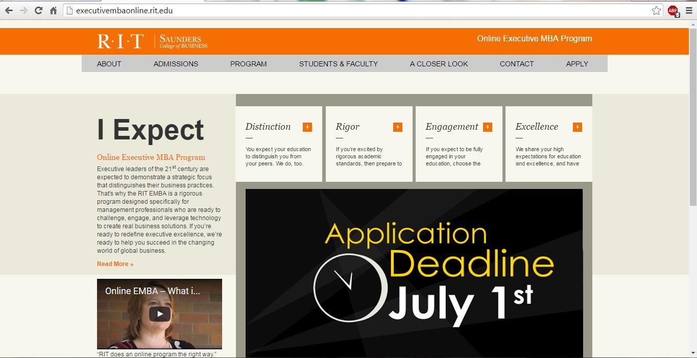
Take a look at this web page for a brief moment:
One of the main things that stands out is the text, “I Expect.” It’s attention-grabbing, and my cursor was immediately drawn to it. I expected (no pun intended) that there would be a link I could click on to get more information, but this was not the case. Instead, there are some drop-down bars under the headings for Distinction, Rigor, Engagement, and Excellence. The “I Expect” text is connected to these attributes, but most of us at the HubSpot User Group meeting did not pick that up.
Just like the website in the example above, it’s difficult to grasp what exactly this page is promoting. The majority of the real estate is taken up with an application deadline and the “I Expect” area. The qualities listed here are important, but should not be so prominently placed. Some basic information about this graduate program would be helpful. And in thinking about SEO, it’s also important that titles and content headers reflect a website’s best keywords. For this online MBA program site, “I Expect” is unlikely to help them out in that regard.
As an afterthought, we also talked about how educational programs like this one are sometimes associated with a subdomain. This is because they’re usually linked to a professional institution, and that institution probably wants the credibility associated with the page. From an SEO standpoint, this element should be evaluated on a case-by-case basis; but generally speaking, unless you’re a professional institution (like RIT) or you have an established presence (like ESPN), it would be better to create a separate landing page off of the root domain rather than to have a subdomain.
#3: Ronco Communications
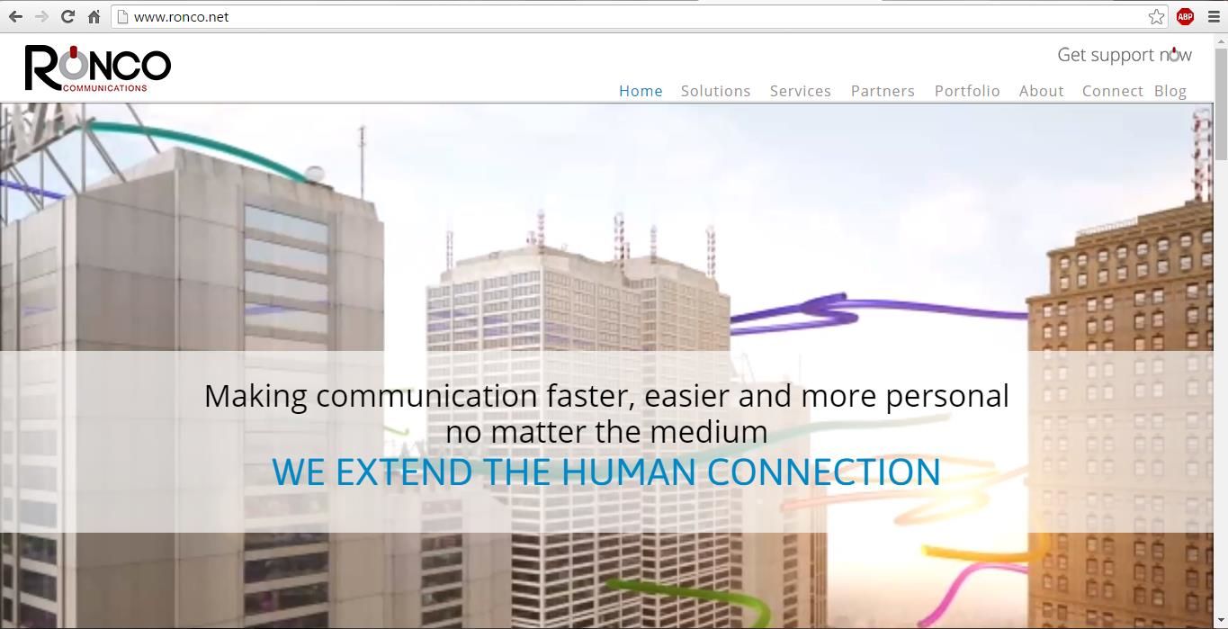
The first element that I was drawn to on this last example was the floating header that says, “We Extend The Human Connection.” This captured my attention and made me want to scroll down further to learn more. And although you can’t tell from this screenshot, the background image of the buildings is actually part of a video slideshow, which is another great element to capture the attention of the user.
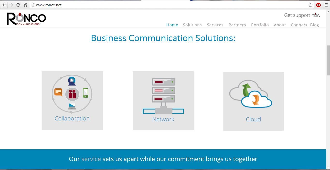
The next section of the homepage gave some very important information that users would likely be searching for. First, it confirmed that the company offers business communication solutions. Second, there are three text links I can click on to learn more about each “solution.” This is a great way to show users how the company and their business solutions could help them.
There are also eye-catching images for Collaboration, Network, and Cloud. At the meetup, we noted that each of these images were optimized for SEO with image titles, so when we hovered over them, a small explanation appeared. This is essential to informing search engines that you have an image and showing them what it’s about. There are also image alt tags on this page describing the images in brief taglines. This helps to rank the images during a search for collaboration software, or something similar. So, all in all, this site had some very strong UX and SEO elements that other sites can emulate.
Conclusions
SEO and UX are both essential when analyzing a website’s overall effectiveness. But you don’t have to be an expert to figure out what can be improved on a web page. Anyone can take the general strategies we used at the HubSpot User Group meeting and apply them to their own sites. And if you’re ever in the neighborhood, stop by the next Buffalo meetup to see all this in action.
If you want to learn more about search engine optimization or any other digital marketing services, please visit mainstreethost.com/blog and browse by topic!


