Ever wish you could spy on your customers as they interact with your website?
Not in a creepy way, of course, just as a way to glean insights on what’s working and what isn’t. Businesses have deployed tactics similar to this for decades: secret shoppers, focus groups, etc. Theoretical concepts about how to run a business – both digitally and within a brick-and-mortar – only get you so far. At a certain point, it’s vital to see what’s actually happening when potential customers interact with your business.
One effective example of this is screen recording software. This kind of software does just what you’d think: lets you see screen recordings of users navigating through your company’s website. Whether they bounce (leave your site) right away or click from page to page before completing a form, you’re able to see where they are clicking, how far they scroll, which elements they engage with, and more.
One such tool – Mouseflow – can be daunting for businesses new to screen recording or web design in general. We created this video to help ease you into the process. Once you get the hang of it, you’ll be tweaking and testing your website until it’s a well-oiled, high-performing conversion machine!
Video Transcript:
User Experience Software: An Introduction to User Behavior Data
Screen Recording, mouse tracking, and heatmaps provide insights on how visitors are using your site. These tools allow you to identify trends, collect user behavior data and diagnose areas to improve on your website. This is accomplished by recording mouse activity, then quantifying the data collected.
By using screen recordings and heatmap software, you can observe common sticking points, distracting elements, common patterns, mis-clicks, and unexpected behavior hindering your customer’s ability to convert.
In this video we will take a quick look at the various data and insights provided by this type of software. We will be using Mouseflow, but the information provided will be applicable across numerous applications like Hotjar and Clicktale as well.
Heatmaps:
A heatmap is a graphical representation of mouse activity overlaid on the pages of your website. The user engagement is expressed in a range of colors. Red corresponds to significant activity and blue equals little, or no activity.
Mouse Tracking Heatmaps are used to visualize visitor’s activity on a page. Heatmaps monitor screen elements users are clicking on, what they pay attention to, and how far down the page they are scrolling.
We’ll look at a few different types of heatmaps today including: Click, Scroll, Movement, Interaction and Geography.
Click Maps:
Click maps identify elements users are clicking on while visiting a particular page. These maps verify that users are engaging in the key elements of the website. They can also identify buttons which users fail to interact with and are valuable in identifying mis-clicks.
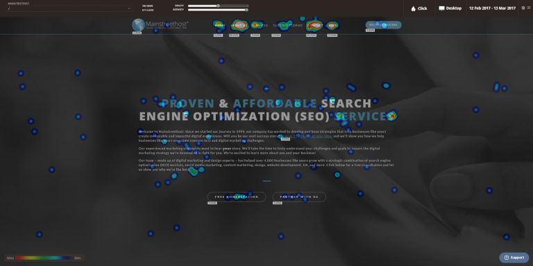
Looking at a click map for our website
Here, you see a screen overlay representing where users are clicking. The chart in the lower left shows a range of intensities with red and white representing the areas that are most clicked. Blue and black shows areas that receive little to no interaction.
On the click map for mainstreethost.com’s homepage we can see that these bright colors in the navigation and around this CTA show significant interaction, which is exactly what we would hope for.
But it also shows some mis-clicks, like here, where the user may be expecting this non-clickable element to be clickable. Perhaps users would like additional information about this topic, or this element should be made clickable.
We can also see that this link in the body text is receiving minimal clicks. This may be an indication that this link is inefficient, or a distracting element that does not help us achieve our goal. We should consider testing the removal of the text link to see if it is helpful for conversions.
In the upper right we can control the device that we are viewing the heatmap from, we have desktop, tablet and phone options. We can switch to the phone overlay, and discover how mobile visitors are interacting with our site, and how it differs from traditional desktop visits.
Scroll Maps:
Scroll Maps show us which parts of a page are visible, and what percent of users are scrolling down the page. They can help us identify if key content, like a CTA or add to cart button, is too far down the page, and therefore invisible to the majority of users due to lack of scrolling.
Again, just like in the click map, displayed in the lower left are the maximums and minimum colors indicating the visibility of the page.
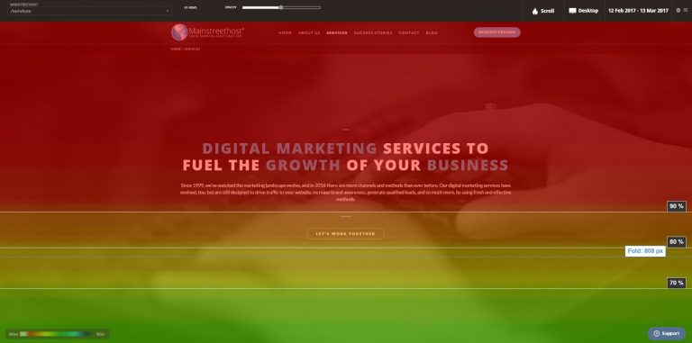
Taking a look at our services page:
The top of the page is Red, and receives 100% visibility, meaning all users are seeing this portion of the page. As we scroll down the page we can see the color of the overlay changes indicating that users are falling off, and no longer scrolling.
We can see here there is a sharp fall off of users. This is commonly identified as a visual breakpoint and occurs when the user assumes there is no valuable content below, and elects not to scroll any further down the page.
Identify excessive fall-off and consider creating more engaging eye paths, and visual cues to keep the user engaged.
The fold line depicted here is the average portion of your site that users can see when first arriving on the page, prior to scrolling. Statistically, the majority of interactions will take place in content that is above the fold.
Movement Map:
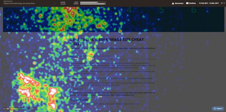
Mouse movement maps show where users move their mouse. Much like with clicks, we’re looking for mouse movement to be centralized around our most important elements, like navigation or a CTA, as they will receive the highest amount of interaction.
As you can see, when we scroll down the page the users mouse movement dissipates, meaning less interaction is occurring the further down we travel.
Movement maps can help address questions like:
- Where is the most effective location for Ads on the page?
- Are visitors ignoring or glossing over certain sections?
- Is the arrangement of the sections on the page correct?
If your CTAs, and important buttons are falling outside of visitor’s movement paths, you may consider pushing those elements towards the users path to see how it impacts your conversions.
Attention Map:
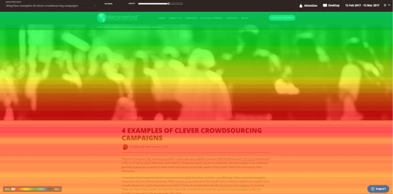
An Attention Map is a time based heatmap that displays how engaged users are with particular sections of your website. The attention map uses scrolling activity to do this, factoring in different screen sizes, and resolutions. This allows you to determine which part of the page has been viewed the most, and can be an effective tool when evaluating design elements.
Areas in red are receiving the most attention from users, while areas in blue and black are receiving little interaction.
Be sure to adjust the priority of your page sections so that the highest numbers of visitors are seeing elements that are collecting the most attention.
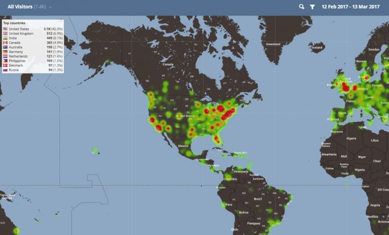
Geography Map:
The Geography Map is an interactive way to determine where your users are visiting based on their IP address. As you zoom into the map you can see a detailed view of landmarks that surround your website’s users.
As you can see mainstreehost.com is receiving a significant amount of users in Buffalo, NY
At the top of the page you can apply a filter based on device, number of pages views, traffic source or even isolate users that complete a desired goal. This can be a beneficial tool to help target your ads or content to where your most profitable customers are located.
User Recordings – Playback:
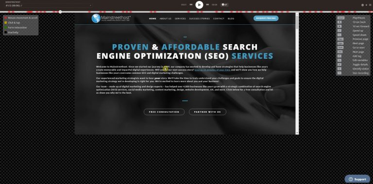
User Recordings allow you to watch real user’s activity as they navigate through your site. You can observe how they behave, problems they encounter, and what paths they take to reach your goals when navigating your website. Screen recordings can be incredibly useful for observing how users complete forms on your site. The level of insight far surpasses what event tracking alone can do in Google Analytics.
The timeline at the top of the screen indicates actions that have occurred during the session
- Red = mouse movement or scrolling
- Yellow = click or tap>
- Green = form interaction
- Black = inactivity
- Playback speed
The multitude of visitor recordings can become daunting. Filters are an effective way to segment your visitors by action. For example, apply a filter that only includes users who made it to your checkout page, or completed a form. Compare data from those who completed a transaction to those who failed to convert to identify areas that caused them to bounce from the page. Use this information to refine your design choices, improve user experience and boost your conversion rate.
User behavior tools combined with analytics data and analysis can assist your sites performance by identifying malfunctions, and reducing sticking points. Behavioral tools, like Mouseflow, can also provide data to craft experiments on your sites design elements, improve your overall user experience, and enhance your conversion rate.


