If you’ve ever wondered whether the elements on your website are doing their job, this is the post for you. We’ve spent months working with conversion-tracking software so that our clients can offer the best user experience (UX) possible.
User-friendly sites come in all shapes and sizes, but we found that ineffective internal links and CTAs were a huge problem on even the most well-designed pages.
Hotjar
Digital marketers, website developers, optimizers, business owners and countless others work to create online content that people respond to. But how should they measure the success of their efforts? Sales trends provide valuable insight into whether or not an ecommerce site is working. But there’s much more to the UX on a site than just sales.
Government websites, for example, exist to educate and inform the public – and to serve as a point of contact between the people and elected officials. So how would you measure the relative success or influence of, say, the U.S. Department of Health & Human Services website?
Hotjar burst onto the CRO (conversion rate optimization) scene this year and impressed the digital world with its arsenal of website tracking tools and its affordability. The site’s various features are responsive and easy to use. Most importantly, Hotjar highlights website issues that are affecting your UX and, therefore, your overall influence online.
Here at Mainstreethost, our inbound team has been working with Hotjar for several months, and we wanted to share what we’ve learned. After installing the Hotjar tracking codes on multiple pages of our clients’ websites, we were able to observe significant trends in user behavior over a period of time.
While each organization’s website had various aspects that were both good and bad, the most common pitfall was the lack or improper use of internal links and CTAs.
Internal Links & UX
Internal links let visitors navigate to different pages on the same domain or website (as opposed to links to and from outside sources). They’re extremely important when it comes to search engine optimization (SEO), but they also simply make it easier for users to navigate through the site. Without these internal links, visitors are forced to dig through the website’s numerous pages to find what they’re looking for. Well-placed internal links facilitate logical navigation through a site (which promotes your UX).
For example, when a site features photographs of different products, there should always be internal links behind the images leading to product pages. If a company’s goal is to sell products, why not make it as easy as possible for customers to buy? These links will take the customer directly to in-depth product information as well as the option to purchase the item.
On many websites, our team found product images with no links behind them. But how do we know this matters?
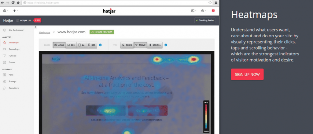
Hotjar’s heatmap tool takes a specific page on a website and shows where users clicked – with more heavily clicked areas showing up red.
Many of the unlinked photographs were clicked on by potential customers – who were presumably trying to find out more about the product and possibly purchase it. If there had been an embedded link behind these images, those people would have been promptly directed to the product page. Without the links, they have to then search for the page they’re looking for.
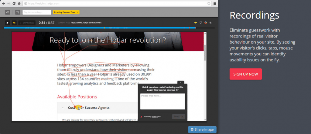
Hotjar’s video recordings tool supports this. With this feature, our team was able to follow visitors’ cursors around the website. All site visitors are anonymous, but we were able to see that many people tried to click on unlinked content and then scrolled around searching for some indication of where to click. Many were clearly frustrated at the lack of direction and abandoned the site within just a few minutes or seconds.
Case Study
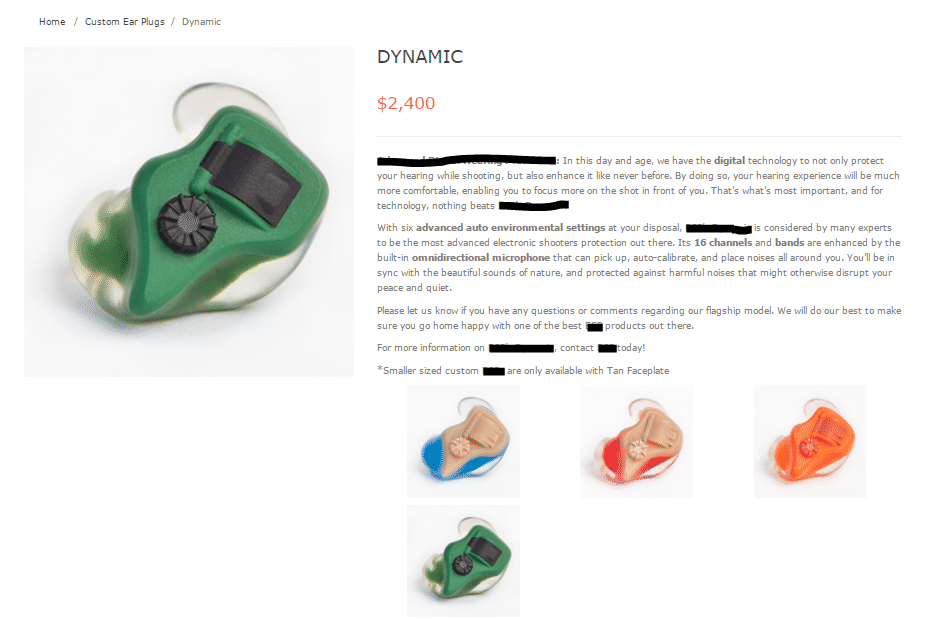
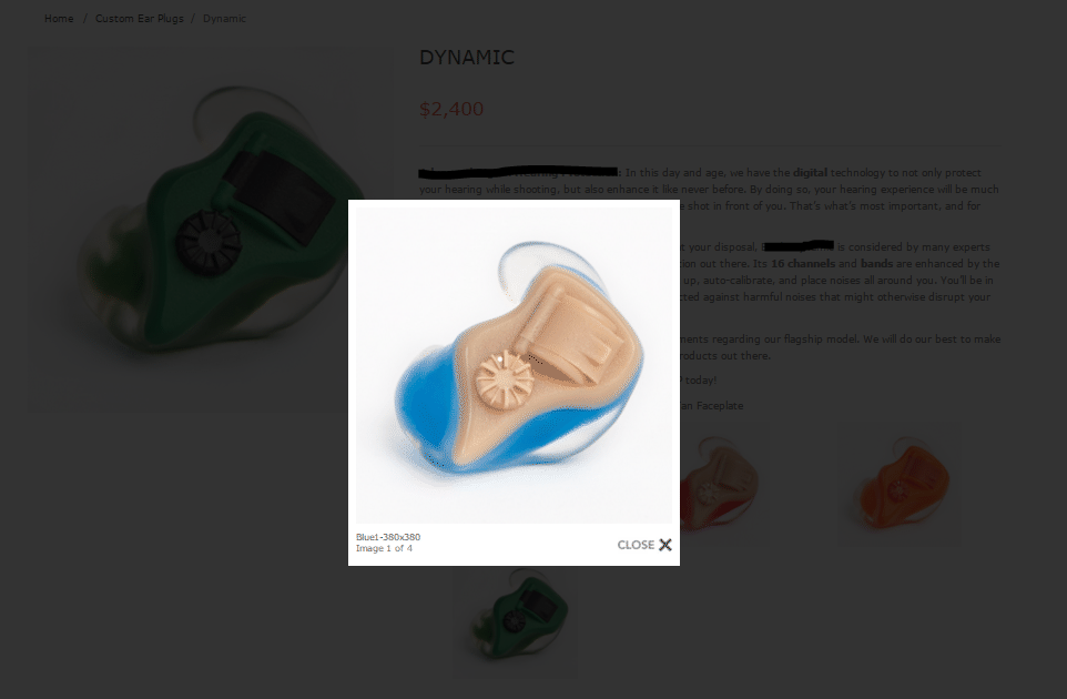
This client sells a selection of product variations. While on any of the product pages, you should be able to click on the others shown below the description to get to those product pages as well.
In this case, clicking on one of the other options will only enlarge the image. To order one of the other products, customers must go back to previous pages.
This is a perfect example of disrupted website flow and poor UX. In today’s digital age, people are increasingly intolerant of site flaws like slow load speed and roadblocks like the example above. You really don’t want to give them any excuse to bounce from your site.
But there’s an easy fix! Simply attach links to the appropriate images to provide seamless UX.
CTAs & UX
CTAs, or calls to action, are elements of web design that facilitate flow and positive UX for customers. Our analysis showed that many websites could have better used these tools to send visitors to specific pages.
CTAs are determined by the goals of your company or organization. Is your main objective to increase sales? Maybe to raise awareness for a cause? Or is it to get signatures on a pledge? All CTAs should call direct attention to themselves and ultimately persuade visitors to click them. Of course, there should be an embedded link present that sends people to the predetermined page.
Let’s look at Hotjar’s heatmap feature that shows click density again. We all know that common CTAs like “Reserve Your Tickets Now!” should have high amounts of clicks (if they don’t, it’s time to re-think placement – keep reading). But many of the websites we analyzed either failed to include CTAs or placed them ineffectively at the bottom or sides of pages. Ineffective language of CTAs was also a big problem. The text should include a very clear direction. As a result of these issues, there were many CTAs that had little or no traffic at all.
Effective CTAs also help take customers through the buyer’s journey on websites. But even if your website doesn’t involve ecommerce, you can still include CTAs that tell visitors to email you, call you, or visit your location. Again, just make sure to include a link behind that CTA that takes your customers to an appropriate page: contact info, map with directions, etc.
Case Study
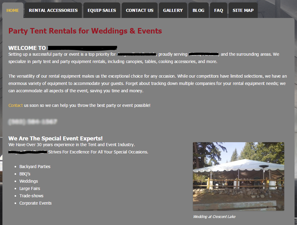
Let’s look at another client example to see what all this means. Starting on the homepage, it’s not immediately obvious to a first-time visitor how to book a tent. Can we choose a date and book online? Do we have to call them to make a rental reservation?
On reading the small text on the page (something you should never assume your customers are doing), we can see a “Contact Us” link. If this organization wants its customers to contact them in order to book, there should be a large and eye-catching CTA button placed at the top of the page or “above the fold.”
Above the fold refers to the common cut-off point for your website on most computers. When you go to a site, the top content is visible and the rest can only be seen by scrolling down. Place CTAs above the fold to maximize visibility.
If you’re curious about how far down your page visitors are actually scrolling, the heatmap feature (shown below) collects data from clicks, cursor movement and scroll.
Although the text might be hard to read, we’ve circled the “Contact Us” CTA from this site’s homepage. As you can see, it’s below the average fold. Size, coloring, and message matter – and so does placement.
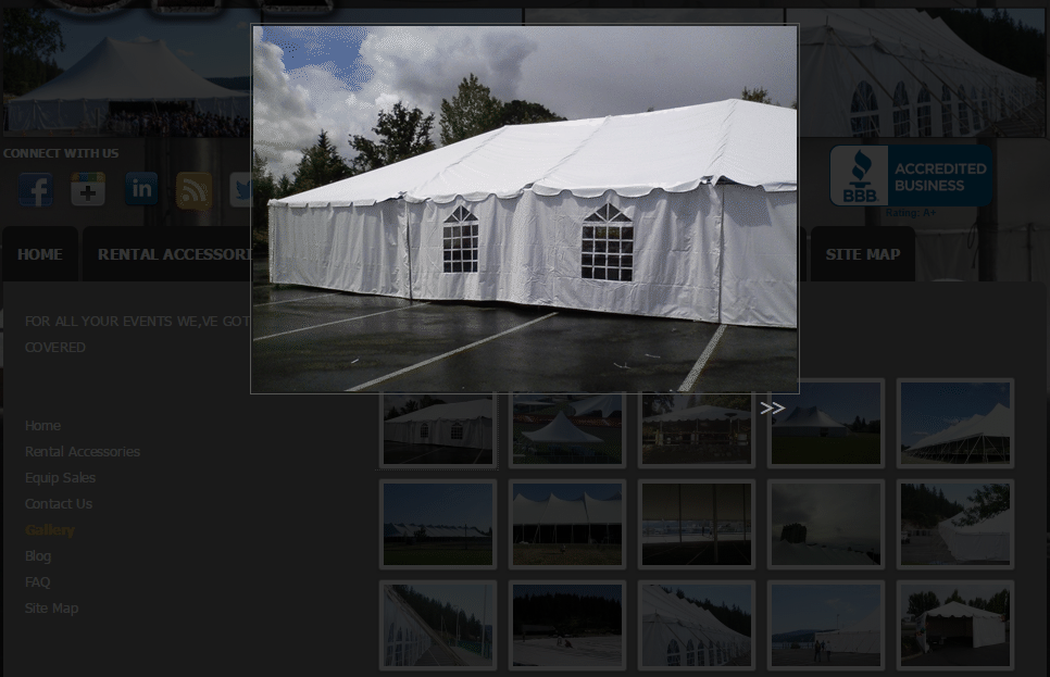
As a last example, let’s go to the Gallery tab on the site’s main navigation. A person seriously interested in booking a tent from this company would likely go to this page. While looking at pictures of the tents, what if the visitor sees one they are sure they want to book?
On this client site, there’s no way for the customer to know what they are looking at in the gallery. By clicking on one of the images, we only get an enlarged version. There are no product descriptions (or even the name of the product), and no direction as to what an interested party should do next.
A creative way to grab customers right from this page would be “Book This Tent NOW” CTAs under each different product. Entice them into clicking and becoming a customer!
Takeaways
We could go on and on about Hotjar and all of the great things we’ve learned from it. But out of everything we observed, the lack of links and CTAs was particularly harmful to site navigation and overall UX.
The addition and proper use of these elements can make your site a seamless experience for your customers. Don’t make them work to find your products and services. Treat your customers like kings and queens and deliver what they want on a silver platter. They’ll thank you for it!


