Your “Sort By” Options Need Spring Cleaning
Offering “sort by” options to your online shoppers is a must. It puts them in complete control over the stream of potential purchases. Aside from convenience of not leaving home, these types of added control elements are what make eCommerce so enticing to customers. Imagine being able to walk into a store and immediately (with one click) reorganize the entire product layout in a way that is best suited to your browsing desires. Seriously, there’s genuine power in sort-by options, and using them to best equip your customers will work to the advantage of your conversion rates.
“Sort by” options shouldn’t be based on the things that you think are most important to sort by, they should be based on how your customers feel (and how they have behaved in the past). Use your site’s analytics to determine the order in which customers are viewing items when they have to go about it manually. If patterns emerge in the manual behavior patterns, you’ll be helping your converting cause – and making their lives easier – by instituting a one-click way for them to view your items on their own terms.
It is also important to be choosy when picking and arranging these options. Once again, analytics are king. Only make changes when there truly is a long-term pattern of viewing history that points to a particular way to sort items. The reason is that over-cluttering your sort-by options will have the opposite effect of what’s intended. It’s well known that an overabundance of choice can have a paralyzing effect on consumers’ buying patterns, and the same can apply to the options they have for sorting. If the options on your site are cluttered with rarely used categories, it can be overwhelming to the eye. If there are 5-7 carefully selected options (proven by past history of viewing and buying patterns) the immediate reaction from the customers will be a positive one.
You’re Being Vague
As the online buying process unfolds, there will be various points that will call for you (or more accurately, your site) to give your customer a message about what’s unfolded so far – and what needs to happen still – in order to complete the purchase. These types of “check-ins” can be casual and their tone can reflect your personality (in fact these are best practices), but that doesn’t diminish their importance.
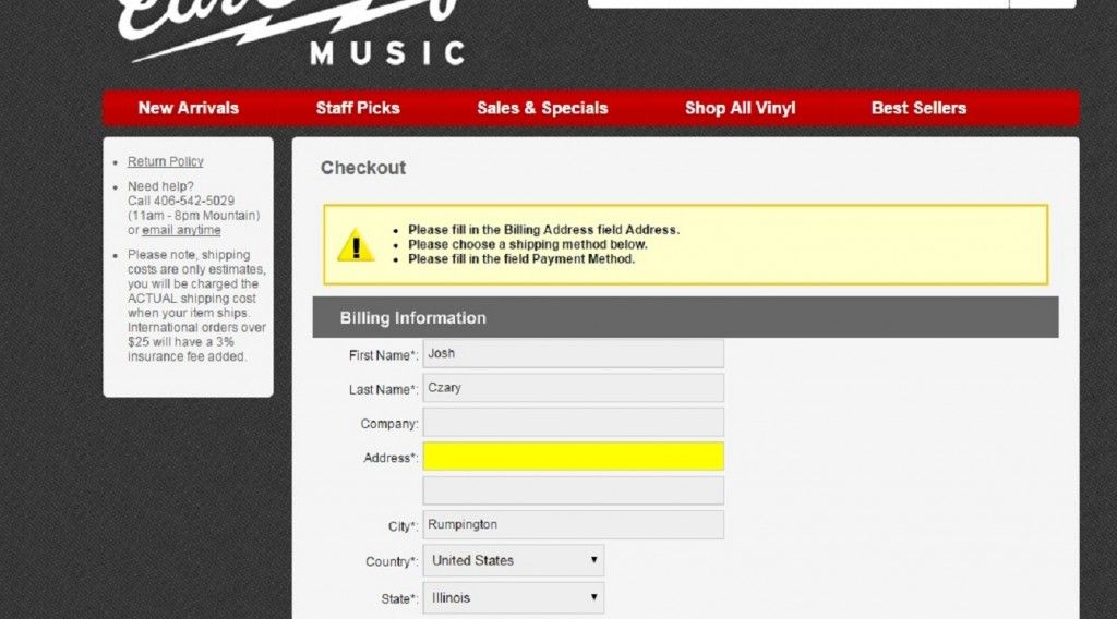
For instance, if a customer fills out his/her payment information incorrectly and therefore the transaction is unable to be completed, the message that pops up on the next screen should explain exactly what is causing the delay. A general, “Something Went Wrong” message will leave the customer bewildered and skeptical of your site’s functionality. By lifting the veil, so to speak, on the eCommerce process, you allow the customer a certain level of comfort. They know exactly what needs to be done to fix the original error, and the fact that it was explained to them in detail (without any extra digging from them necessary) will make them feel good about the transaction and lead to repeat customers. In the example below, it’s clear that the user wasn’t even forced to go to a separate screen, at all, being told immediately which field was left blank. This is important because it will prevent the user from having to re-enter the information that was entered correctly. These little processes streamline the buying process and help build an experience worth repeating for your customers.
Similarly, be open and honest about the positive things that are occurring during the transaction process. For example, if you have promotional opportunities that could be related to a purchase someone is making, it’s vital to make that right away. For example, if someone is purchasing a $45 item and you offer free shipping for orders over $50, set your ‘Proceed to Checkout’ link up with a blurb underneath, reminding the consumer of that opportunity. Just like in a brick and mortar location (but with even more potential impact, as there is more room for personalization), you want to advertise the sales available: that’s why you decided to have one, right?
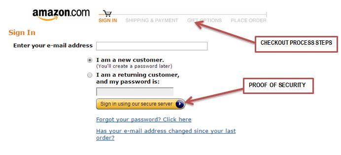
When a transaction is going smoothly, give step-by-step status updates to let the customer know how the entire process will unfold. This is typically represented visually by a broken bar horizontal line at or near the top of the window. The section that is currently being completed will be highlighted and the descriptive (naming and briefly explaining that current step) information will correspond below.

KitchenAid‘s Visible Checkout Process
It’s also important to be explicit about your site’s security. Tell your customers in clear terms that the sections requiring them to enter personal information are part of a secure site, and that they are not entering any danger of having that info wind up in the wrong hands. It doesn’t have to be broadcast in large, brightly colored letters on every page, but don’t shy away from including a prompt such as: “Enter Secure Checkout Here” on a link to the checkout page. As with any area of your site’s functionality, it’s paramount to maintain an image of authority and security, but without including anything too boastful or sales-y.
You’re Not Giving Fence-Sitters Enough Reason to Stick Around
If someone is viewing a product page on your site, there is a chance their mind has already been made; this is the product for them. All they need to do now is make sure the right specifications are in stock, enter their payment information, and conveniently complete the purchase from the comfort of their home.
Unfortunately, this will not be the norm. Most people viewing your site will be doing so as a part of their actual “shopping around” process. In these cases, how your eCommerce process is set up will be the difference between a quick bounce and a sure sale.
For starters, keep cart abandonment at the forefront of your strategy. Cart abandonment is a major factor in the world of eCommerce. Since so many of the people viewing your product pages are utilizing the convenience of online shopping to “window” shop, it’s only natural that abandonment numbers are high. This unfortunate phenomenon, however, includes an inherent opportunity as well. All of those lost sales represent a huge opening for you to increase your eCommerce revenues.
One great way to start accomplishing this more consistently is to use software reminder tools. These are ways to reach out to your consumers (not as an interruptive approach, just as a way to remind them that the product they had chosen to put in their cart still hasn’t been purchased) and reopen the purchasing discussion. At one point, for at least the length of time it took for them to put the product in their cart, they were under the impression that it was something that would be of value to them. It’s your job to study your site’s analytics, find out what may have changed that thought process, and use every outlet available to reopen the discussion. One such outlet is the Cart Closer from Conversions On Demand, which offers a pop-up tool to remind consumers of their not-yet-purchased product.
It’s also important to utilize A/B testing to avoid abandonment. Some tools (including the Cart Closer) will include easy-to-use A/B testing within the software itself. Whether you go this route or you use the other software (whatever you use for your general site analytics, for example) is up to you, but the important thing is to use something. A/B testing won’t just help for abandonments that occur after the product is already placed in the cart, either. You can also use the method to make sure your site’s layout is fully optimized for purchasers in the first place.
For example, studies have shown that general site navigation should not be included running down the left hand side of the screens for individual product pages. We want those consumers focused on the product they’ve clicked on and how to put it into their cart, so leaving the navigation options right where it was on the general page is a distractor. Instead, relegate it back up to the header so that your customer is immediately confronted with a high-resolution photo of the product, and a skillfully constructed description of why it would be of value to them.
Speaking of those high-res photos, this is an important arena for earning sales as well. Give your customers sleek, easy-to-use options for both zooming and cycling through multiple images. The best examples here are those that don’t require a second window to be opened in order to zoom. The less clicking that the customer is required to do, the better. Shown below is an example of HQ photos available to click through without opening new windows. The faster the customer can navigate your photo options, the more intimately they’ll get to know your product. Also, this will enhance the sense of intimacy with the product, making a visitor to your site feel as though they might be in your physical location, picking up the item with their hands and slowly turning it around to inspect it.
Source: Greats
Recap
Sites with eCommerce options give your revenue a second wind and make the road to becoming a customer easier for your target audience. The ways to build those options up and make them functional are infinite, but there are still better ways than others. By steering clear of vagueness, making it easier for online shoppers to follow through with actual purchases, and optimizing your sort-by options, you’ll take full advantage of the added revenues eCommerce success can offer.


